
A Beginner's Guide to Color Theory in Machine Embroidery
Learn how fabric color, thread sheen, contrast, and color harmonies affect machine embroidery—and follow a practical process for choosing your next palette.
By I Love Digitizing 10 min read
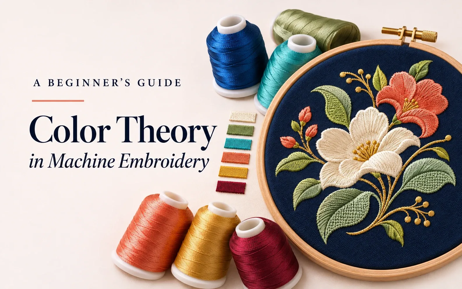
A beautiful embroidery design can lose its impact when the thread colors do not work together. Lettering may disappear into the fabric, flower petals may merge into one shape, or a logo may look different from the original artwork.
Color theory in machine embroidery helps you choose thread colors that create balance, separate details, and make the design easy to read. The most useful starting point is simple: choose colors for the actual fabric, give important details enough light–dark contrast, and check the result with a test stitch-out.
This guide explains how to turn those principles into practical decisions for logos, monograms, floral designs, and everyday embroidery projects.
What Is Color Theory in Machine Embroidery?
Color theory describes how colors relate to one another. In machine embroidery, you use those relationships to decide which thread shades belong together, which areas should stand out, and how the embroidery should interact with its background.
Start with three terms:
| Term | Meaning | Embroidery example |
|---|---|---|
| Hue | The color family | Choosing blue instead of green for a monogram |
| Value | How light or dark a color appears | Choosing pale blue lettering for a navy cap |
| Saturation | How vivid or muted a color appears | Choosing dusty rose instead of hot pink |
These qualities solve different problems. Changing hue can change the character of a design. Changing value can make a detail easier to see. Reducing saturation can help a supporting color compete less with the focal point.
Beginner tip: When two areas merge visually, try a lighter or darker thread before adding another color.
Why Embroidery Colors Look Different from Screen Colors
A digital preview is useful for planning, but it cannot fully predict the appearance of stitched thread.
BERNINA and Madeira both advise using physical thread color cards because screen colors are approximate. For important work, compare actual thread samples against the intended fabric rather than selecting solely from a monitor. [1, 2]
Thread also has a surface that interacts with light. AMANN identifies the yarn, stitch length, and stitch direction as factors that affect embroidery reflectivity. This helps explain why two areas sewn with the same thread can appear different when you turn the fabric. [3]
For your project, check the thread from more than one angle. If the design depends on two nearby shades remaining visibly different, judge that separation in stitched samples as well as on the spools.
How to Use a Color Wheel for Embroidery
A traditional artist's color wheel is a useful planning tool. It organizes red, yellow, and blue with their related colors and helps you identify complementary, analogous, and triadic relationships. Digital RGB wheels use a different color model, so their opposite pairs may differ. [4]
For embroidery, use the wheel to choose relationships between threads. Placing yellow and blue thread beside each other does not physically turn them into green as mixing paint might.
Monochromatic: One Color Family
A monochromatic palette uses variations within one hue, such as light blue, medium blue, and deep blue.
Try it for: A wave motif, a decorative initial, or a simple shaded leaf.
Choose shades with clear light–dark differences if they need to define separate parts. Three nearly identical blues may look attractive on the cones but contribute little separation in a small design.
Analogous: Neighboring Colors
Analogous palettes use neighboring hues, such as yellow, yellow-green, and green.
Try it for: Botanical designs, foliage, or flowing decorative patterns.
Give the colors different jobs. For example, use yellow-green for the main leaf, darker green for the stem, and a small yellow highlight. Check whether the stem remains visible at the final size.
Complementary: Opposite Colors
Complementary hues sit opposite one another on the chosen wheel. Blue and orange are a familiar example on a traditional artist's wheel.
Try it for: A bold badge or a design with one clear accent.
You do not need equal amounts of each color. A mostly blue motif with a small orange feature can be easier to organize than two equally dominant areas. Complementary hues still need sufficient value contrast where readability matters.
Triadic: Three Spaced Hues
A triadic palette uses three hues spaced evenly around a color wheel, such as red, yellow, and blue on a traditional wheel.
Try it for: Playful motifs or colorful decorative patches.
Choose one dominant hue and use the others in smaller supporting areas. If every part is equally bright and prominent, decide which feature should attract attention first.
Start with the Fabric Color
Treat the fabric as part of the palette, even when it does not appear in the thread list.
Imagine a cream-and-sage floral design. On navy fabric, the pale petals may stand out clearly. On cream fabric, the same petals may lose their edges. You might need a darker petal shade, a suitable outline, or a different garment color.
An outline is a design decision, not an automatic repair: it must have enough space and be digitized appropriately.
| Fabric | Starting palette to test | Detail to check |
|---|---|---|
| Navy | Ivory, muted coral, sage | Separation between dark leaves and fabric |
| Cream | Burgundy, forest green, warm gold | Visibility of pale highlights |
| Black | White, turquoise, golden yellow | Definition of dark outlines |
| Heather gray | Deep blue, burgundy, white | Small details against the mottled background |
| Patterned fabric | A limited palette with distinct values | Competition between the motif and fabric pattern |
These combinations are illustrative starting points, not guaranteed thread matches. Preview them on your material and stitch a sample before committing to the finished item.

Use Value Contrast to Keep Details Readable
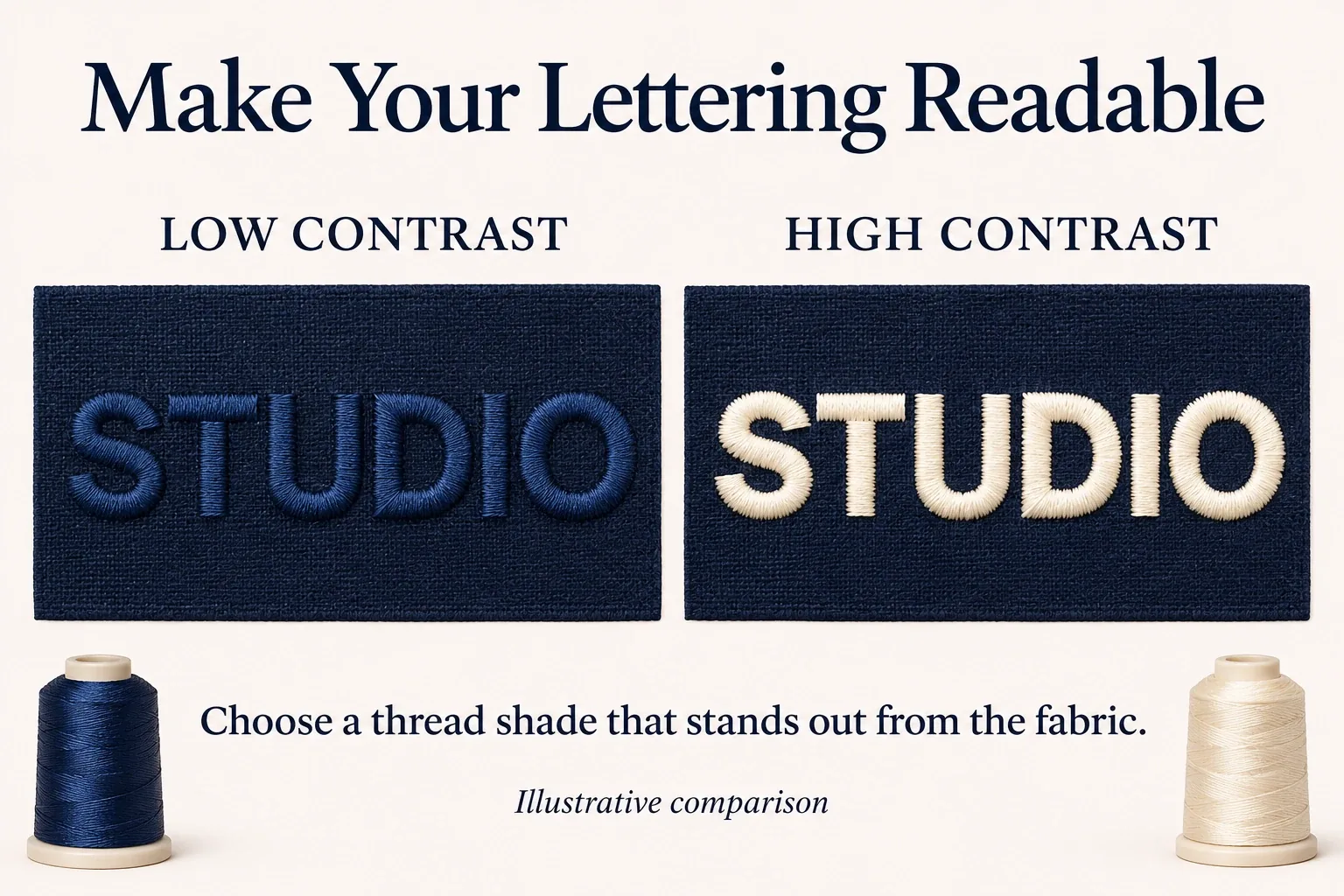
Colorful does not always mean readable. Two different hues can have similar values and become difficult to distinguish in small lettering or narrow borders.
For a readable cap logo, first identify the essential feature: perhaps the business name. Choose its thread against the cap fabric before selecting decorative accents.
Then check the design at its intended size. A border that looks clear in a large preview may become insignificant when the design is reduced.
A grayscale preview can help reveal weak light–dark separation. Treat it as a screening tool: a phone photograph or software preview does not reproduce every effect of real thread and lighting.
If information must remain understandable, avoid relying only on a red-versus-green distinction. Labels, shapes, spacing, and value differences can provide additional cues.
How to Choose Embroidery Thread Colors: Seven Steps
1. Define the Main Purpose
Decide what the design needs to communicate. A business name requires readable lettering. A shaded flower needs recognizable petal structure. A decorative monogram may prioritize a subtle appearance.
Choose the feature that must remain clear before choosing the entire palette.
2. Put the Actual Fabric Beside Your Threads
Use the intended garment or a matching sample. Compare physical thread shades directly against it. For appliqué, include the appliqué fabric in this comparison.
3. Build a Small Working Palette
For a simple beginner motif, try three thread roles: a main color, a supporting color, and an accent. Add colors when they serve a specific purpose, such as separating a petal from a leaf or creating a necessary shadow.
There is no universal ideal color count. A portrait and a one-color logo have different needs.
4. Check Adjacent Areas
Ask where one part ends and the next begins. If neighboring shapes need to remain distinct, compare their values as well as their hues.
For a small flower, a clearly darker center may define the shape more effectively than several barely different petal colors.
5. Confirm Physical Thread Matches
Record the thread brand, range, and color number. A name such as “royal blue” is not a precise production instruction across different manufacturers.
For a branded logo, ask for the customer's approved color reference and offer physical thread candidates. Madeira explains that its Pantone references represent the closest available matches under specified viewing conditions; an exact authorized match is not always available. [5]
6. Stitch a Representative Sample
Use the intended design size and the planned thread, fabric, stabilizer, and needle setup. Include small lettering, boundaries between similar shades, and any shading that is important to the result.
If fabric shows through a fill, review the stitch construction and stabilization. Do not assume that increasing density everywhere will solve the problem; a dense design can create other stitching difficulties.
7. Review and Record the Result
Inspect the sample up close and from the distance at which it will normally be seen. Check it under the expected lighting. For customer work, obtain approval of the physical sample when color accuracy is critical.
Save the approved thread list, fabric color, design version, and sample reference so a repeat order can follow the same specification.
Worked Example: A Floral Design on a Navy Sweatshirt
Suppose you are planning a small floral motif with pale petals, green leaves, and a yellow center.
Start by placing ivory, medium sage, and muted golden-yellow thread against the sweatshirt. The ivory establishes the flower as the focal point. Check whether the sage remains distinct from the navy and whether the center separates clearly from the petals.
If the leaves disappear, test a lighter sage. If the center is hard to see, compare a deeper gold before adding a dark outline. If the design feels too busy, remove a decorative accent before changing the main flower.
Stitch the motif at its final size. Review the sample from normal viewing distance, then inspect the small details. This sequence gives each color change a clear purpose.

Creating Shading and Depth with Thread
For a first shading exercise, choose a light, medium, and dark version of one color. Use them to make separate areas in a petal or leaf, then check whether the shape reads clearly.
A smooth gradient requires more than selecting extra shades. Wilcom's blending documentation describes transitions made with controlled combinations of open and dense fills. Stitch spacing and layer construction are part of the effect. [6]
Ask your digitizer whether the design should use separate color areas or a blended transition. Simply stacking several solid fills can create unnecessary thread buildup.
Common Embroidery Color Mistakes
| Problem | What to review |
|---|---|
| Lettering disappears into the garment | Thread-to-fabric value contrast and lettering size |
| A shaded shape looks flat | Separation between highlight, base, and shadow |
| Every detail competes for attention | Which color should dominate and where accents belong |
| The same file disappoints on another garment | Palette suitability for the new fabric color |
| A converted thread shade looks wrong | Physical samples from the replacement brand |
| A good palette still stitches poorly | Digitizing, thread coverage, stabilization, and machine setup |
Color selection and stitch construction work together. Changing colors cannot resolve every production problem.
Frequently Asked Questions
What are the best color combinations for machine embroidery?
The best combination depends on the fabric, design size, and intended effect. Start with clear separation for essential details, then choose a harmony that suits the project. Ivory on navy and burgundy on cream are useful pairings to test.
How many thread colors should a beginner use?
For a simple motif, three colors can be a manageable starting point. Use fewer or more when the design requires it. The goal is to give each color a purpose.
Can I substitute another brand of embroidery thread?
You can consider a substitute, but compare physical shades and confirm that the thread type and weight suit the design. A conversion chart is a starting reference rather than proof of an exact match.
Why does my machine display different colors from the design sample?
Displayed colors can differ from a designer's stitched sample. Follow the supplied color-change sheet and thread specifications rather than choosing by the machine preview alone. Embroidery Library specifically directs customers to its color sheets for the colors used in its samples. [7]
Can I change colors without changing the stitch order?
You can often substitute thread shades while following the supplied sequence. Reordering color blocks is a separate decision: the sequence may control overlapping objects, outlines, or construction steps. Check with the designer before changing it.
Choose a Palette You Can Trust on Fabric
Start with the actual garment, choose a clear focal point, and check the light–dark separation of important details. Use color harmonies to organize the palette, physical thread samples to select shades, and a stitch-out to verify the result.
Need help preparing your artwork for embroidery? Explore I Love Digitizing's embroidery digitizing service. Send your artwork with the finished size, fabric type and color, preferred thread brand, and any brand color references so the design can be assessed for your project.